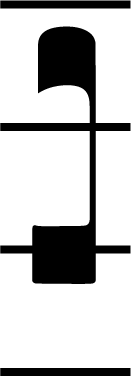
A podatus from Caeciliae enlarged.
Shape and form
One of the chief motivations in the development of Caeciliae is to create nicer chant notation by elegant and sophisticated design. The principal inspiration for this comes from the many pioneers of square note notation. Caeciliae tries to further the ingenuity of our predecessors by utilizing modern typesetting design technologies.
Although square note notation began with a relatively small set of symbols/neumes, more recent transcriptions employ a much larger colection of symbols to denote the musical progression. Much of this growth in notation is a result of the scholarship of chant begun in the nineteenth and twentieth centuries. Interest in chant has become increasingly concerned with preserving the the nuances of the original transcriptions of the sung chant. With a larger repertoire of neumes and symbols, however, distinguishing between them in print becomes more critical. Thus Caeciliae is not only concerned with preserving the form that has standardized the use of chant in the liturgy throughout the world, but also with the ongoing improvement of chant notation in legibility and finesse.
As a simple example of the attention to detail for which Caeciliae strives, we can examine the podatus to the right. Notice the subtle features: the light upward curvature underneath, a small lip at the upper left hand side of the lower note, and a flowing underbelly that comes to a sharp point in the upper note. The vertical line maintains precise tangential intersections with the lower component and the upper component on both inner and outer sides.
Overall, Caeciliae tries to preserve the balance and contrast of the notation by taking special care to create symbols of optimal size. Various steps are taken into consideration for the sizing of the glyphs, including:
- Analyzing the ratio of size to line width and line spacing.
- Avoiding unsightly intersections between the myriad arrangements of component glyphs.
- Identifying distinguishing sizing of symbols (for example, a close examination of the podatus at the right shows that the lower note is slightly wider and flatter than the thinner and more flowing upper component).
By creating glyphs of precise size, Caeciliae avoids undo boldness in the notation (which can detract from the text itself), while at the same time maintaining the distinct features, legibility, and character of every glyph.
Stems

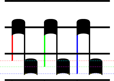
Custodes at different levels in Caeciliae.
One important feature of typography is the close attention paid to the length of ascending and descending lines. Consistency is important, but variation is helpful to avoid a mechanical rendition and to distinguish characters.
The stems and line lengths in chant notation are just as important. By observing the points of intersection between vertical lines, horizontal lines, and the musical elements of the staff, we can improve readability of the notation.
As is often the case for chant, the stem length depends on the placement of the musical element in relation to the lines and spaces of the staff. The image on the left showing the custodes is a good example of minute differences in stem length of elements, depending on the height placement of the chant element. You can see that the stems change direction depending on the height of the custos. But the custodes also have different stem lengths depending on whether they fall on a line or on a space. As the dotted red lines highlight, custodes that fall on lines have slightly longer stems in order to maintain clear intersections with the staff lines.
Variations in stem length offered by Caeciliae. Such variety gives the user flexibility to pattern the stems according to source, style, or preference.
Sometimes, however, the stem length must be a little more flexible. For this reason, Caeciliae provides line types that descend to various steps. The figure to the right, by coloring the descending stems on the clivis, highlights the variation in descending length that Caeciliae allows.
While inputing the different line heights is simple simple to do, discretion is left to the user for deciding when to employ the correct stem length for such descenders. For example, it is unlikely that the green (center) length would be used to end on a line. Such a descender would terminate in an abrupt intersection with the staff line and could potentially hinder readability. On the other hand, some earlier books use precisely this length. Reproducing such neumes might be preferable for the user, despite the visual artficats.
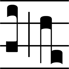
Elements that demonstrate the different line widths/weights on the staff.
Finally, the weight of the lines are just as important as the length. Caeciliae employs thinner lines for the elements composing the neumes, medium weight lines for the staff, and equally or slightly bolder lines for division marks. The clear staff lines help guide the eyes across the page, while thinner lines for the neumes create a distinctive but less distracting form for vertical lines on the staff.
Kerning, Alignment, and Neumes
One of the trickiest part of creating creating high quality chant notation using font technologies lies in how to create more complex neumes. It would be impossible to create distinct neumes for every possible combination of notes, heights, decorators, and styles.
Caeciliae, as other chant fonts, solves this problem by combining component glyphs to create these many different types of neumes. As can be seen in the porrecti above, Caeciliae can combine line elements with musical elements to create more complex neumes. What distinguishes Caeciliae is the attention to detail in fitting all the pieces together with careful spacing.
First a little background though. Spacing in typeface history is nothing new. Ever since the invention of moveable type, typeface designers have been creating solutions to space letters smoothly. For example, When an uppercase "T" is followed by a lowercase "h", you would expect the "h" to be far enough to the right so that the upper lines of the letters don't intersect. On the other hand, when a capital "T" is followed by a lowercase "o", the "o" should be slightly tucked under the horizontal line of the "T" to avoid unsightly spaces. Different sequences of characters require different spacing. This process is called kerning. Good typefaces/fonts have carefully crafted kerning values that help with spacing the letters properly. (For more on this topic, see the Wikipedia entry devoted to kerning).
Caeciliae uses kerning to combine neumatic elements smoothly and cleanly. Consider the following figure:
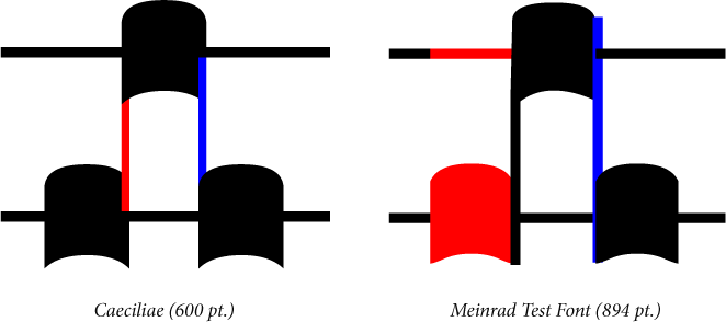
A close up comparison of creating neumes in Caeciliae and the Meinrad Test Font. Neither font has this specific torculus as one distint glyph in the font, so it is necessary to create it out of component pieces. We can see here that Caeciliae and the Meinrad Test Font have important differences in spacing and layout.
The different component glyphs of the torculus neumes above are colored to highlight the spacing. When line elements are preceeded or followed by various neumatic elements, Caeciliae automatically adjusts the overlap of the elements to create nice intersections. Caeciliae actually moves the neumatic elements back to overlap with the connecting lines smoothly. We can see that the blue and red lines overlap precisely with the notes in order to create a seamless neume. Not only are the elements connected smoothly, but the width of each note of the neume is maintained.
The Meinrad Test Font on the left does not use kerning. Therefore, in order to combine elements, there will always some unsightly butting up of elements rather than smooth combinations. This is visible in how the lines connect with the other elements. The first lower element is butted up against the ascending line, and the upper element is butted up against the descending line. More subtely, we can see that even the final neumatic elements does not cleanly connect with the line higlighted in blue. (Incidentally, we are not trying to pick on the Meinrad fonts. Indeed, this author is not aware of any other Gregorian chant font that creates neumes with both consistently sized elements as well as smooth intersections between connecting lines and neumatic components. The closest this author has seen is the more stylized chant font Gregoria, which contains no kerning information. Gregoria tries to minimize artifacts by creating lines that follow the curvature of the neumatic elements at the extrema. Unfortunately this solution still creates notes with varying sizes.)
To be sure, these details are much more obvious at very large point sizes. Some might argue that they are virtually irrelevant at print resolutions. Nevertheless, artifacts by misaligned elements can be visible to the attentive observer, especially at high resolutions and high quality printings. Caeciliae avoids such artifacts by precise alignment of combining neumatic elements.